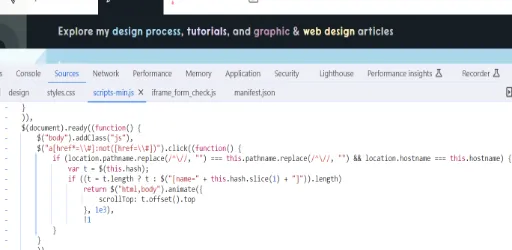
Code
One thing I found creative was in the header of the articles page where it says "Explore my design process..". Each word has its own color which are also paths to the sections on the page that have to do with the category. I was curious how the web developer put this together so I inspected. What I found was that they used a span to wrap each text for styling purposes. In the span was element "a" and each word had a class with the name related to the page section, such as "design-process-on-dark-link".vEach having their own color and path that brings you down automatically without having to scroll. The path to the section is an on-click event by the user, in the event listeners section on inspect, the click tab unfolds that each span holds a different class name but has the same function happen providing the javascript code.
UI
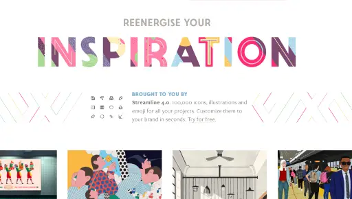
I think this user interface is very creative and full of artistic images and many colors on some pages that have me drawn to the screen. To some, I feel they might think its a little too flashy but I personally like it. I assume the web developer did not want to make it too hard to read, so they use a lot of white background so that their are not too many colors considering a lot of the images already are extremely detailed. Since this website provides numerous images, I think it was smart of the developer to keep it simple yet be creative at the same time, with the different headings, icons on the navigation tabs, very illustrated backgrounds and also some animations that occur on some of the pages.
UX
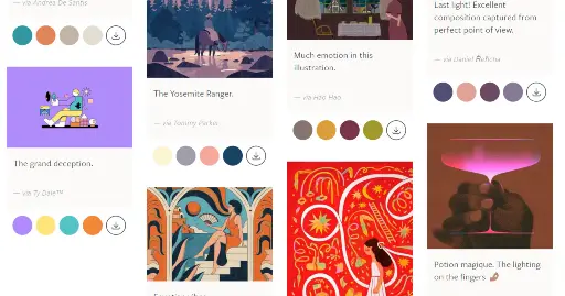
As far as the user experience goes, I think this site isn't complicated at all to use and very easy to get around. Although, I had one little thing that bugged me on the page I liked the most and thats the "inspiration" page that shows many different images by different artist. As I was scanning through these awesome pictures, I noticed that the layout of all these figures are not all even. Im not sure if the web developer intended this but it is distracting to me. I think maybe because theirs no border around each figure so all the words and images just feel like they are scattered all over the place. I think even maybe just adding a light background-color behind all the content that belong to each other would make it more easier to view artist's work.
Summary
The Veerle Website is probably one of the most artistic sites I have came across, the website only had a few minor issues by personal opinion but overall, I enjoyed scamming through it. It is wonderful sight that provides tutorials and images that you can use on your projects to make your site more visually appealing.